April 26, 2024

A GREAT Local Artist and Friend


Rob grew up in Waynesboro, VA where he learned to love the outdoors. He attended and graduated from the Art Institute of Atlanta in 1985 with a degree in Visual Communications.

After college, Rob moved to Charlotte, NC and worked for several advertising agencies before joining one of the nations largest banking companies – eventually earned a creative director’s position. His career with the bank spanned 13 years, 3 corporate name changes and countless mergers.
Today, Rob makes his home in Charlotte, NC with his wife Heather, his children Morgan, John and their golden retrievers, Annie and Sophie.
If you don’t find him in the garden planting something colorful or on the lake fishing, he’s probably in his studio trying to put images to paper or canvas.

Where can you see more?
To view additional work, visit The Sleepy Poet where I maintain a permanent display.
 The Sleepy Poet was originally in Charlotte’s Southend but in March of 2008 moved to a larger location at 4450 South Blvd, near Woodlawn Rd. Along with my paintings, I have a large selection of bookends, books and furniture dating from the late 1800’s to mid-1900’s. If you have a day to spend looking for vintage or antique items this is the place to start. Look for me on isle 9 or ask someone at the front desk for assistance locating vendor BWD.           bluewater-design.com
    

Cutting Edge Color! Tangerine

‘Tangerine Tango”: a bright, burnt orange hue was named 2012 Color of the Year by the Pantone Color Institute. here are three ways to incorporate this color, reminiscent of a sunset, in a home.

“Stage it with Accessories.”

A moderate amount of tangerine tango can add just the right amount of pop with pillows,throws tabletops accessories. Pair it with gray-scale neutrals for a modern flair.

“Mix it in the Kitchen”:

Some homeowners are choosing this sunset hue for kitchen appliances to add an extra colorful touch!

“Brighten up a wall”:

Try a painted accent wall in tangerine tango to create a “dynamic burst of energy” in the kitchen, entryway, or hallway!

Have fun and don’t be frightened to experiment..After all: It’s only paint! 🙂

Chabby


How I made my fish table…

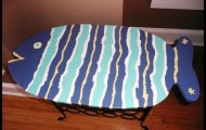
OK, Chabby asked me to share how I made my fish table… This project started with my neighbor sitting one of  those little wine rack tables, we’ve all seen before, on the curb…free to a good home…with a plan in mind, I scooped it up…We were in need of a table that could live on the front porch with the rockers, a place for appetizers when we are hanging out…So this is what I did…First, I flattened out a cardboard box so I could make a pattern for my fish. That way I could create the right size of fish to fit over the existing table top. I decided to leave the original top on the rack because it was sturdy and well attached.

After I got my fish drawn, I cut around it leaving about a 2 inch margin so I could have the ability to tweak the final shape, to make sure I liked the shape and more importantly that it covered the existing top. I then realized that I would need to nip off the corners of the original top to accommodate the roundness of the fish otherwise my fish would’ve had to be a lot bigger.

So now I have my pattern and I went to Lowes to look for a piece of wood. I was hoping to be able to purchase a small piece of plywood instead of a whole sheet but what I found was much better. They had small finger jointed wood in three or four different dimensions, pre-sanded, suitable for a table top. The wood is not a hardwood so you have to be ok that it will get dinged easier and just consider that part of its future character.

Back home, I laid the pattern on the wood and traced my fish, then used a jigsaw to cut it out. Because it is a softer wood, it was easy to cut and the I took a piece of 220 sandpaper and sanded the edges. Then I used the jigsaw to cut the corners off of the original table and I drilled 4 holes so I could attach the screws to the fish from underneath. A little secret I learned a long time ago, is that when screwing two pieces of wood together it is important to pre-drill the first piece of wood for the screw to slide through the hole and only bite the second piece of wood, otherwise they will push away from each other. I then attached the fish adding some wood glue before screwing it together.

Now, the really hard part…How to paint it??? Since I am not an artist, a realistic fish was not an option, so I decided on a “folk art fish”. That translates to no rules. Google is your friend, so I googled folk art fish…I didn’t really see anything that I thought would work for me, but what I did see was freedom, uneven lines, color…

It’s time to pick my colors… I looked around my kitchen and saw a few pieces of fiesta ware grouped together…and decided to use 4 of those colors…so off to Lowes again…I picked paint chips that matched my colors and had them mix samples for under $3.00 a color. This is the best deal ever!!! Back home, I am ready to design…I drew on my pattern till I figured out what how I wanted to paint the fish. I used leftover interior latex primer to prime all the raw wood first. Then I turned the table upside down and sprayed the underneath black (Rustoleum Satin Finish Enamel). I wanted the underneath to seem to disappear, so when you were sitting down, all you would notice was the color.

To apply the paint I used a combination of sponge and small (cheap) artist brushes. I applied the primer and most of the first coat with the sponge brushes and used the artist brushes for the second coat and the eye. It needed a second coat to make the colors really pop. Then I put three coats of clear polyurethane to seal the paint…I always wait at least a week or two before I use anything with poly on it, to give the polyurethane time to cure (ie. harden)…not sure if it really matters, it’s just what I do…and that’s it…we now have a fun table for the porch that cost less than $40.00…And my friends are amazed…You gotta love that :>))  Karen M.

Time For A Christmas Tree!

I am not an aficionado when it comes to decorating a Christmas tree, but do know a thing or two about the placement of a tree in a room. I only came upon this knowledge through countless nights of touring the neighborhood Christmas decorations.  So my best advice is… do not put your tree directly in front of the front window of your home unless the window is a floor to ceiling window. Here is the reason… all that anyone can see from the outside is basically 1/3 or the middle of  the tree. Where is the bottom or the top? All it looks like from the exterior;  a mesh of christmas lights just thrown  in the window. I realize the tree is for you and your family and you can put it anywhere you want. But I also realize that we all decorate our homes for others to see our festive holiday spirit.  This is why I say, pick a spot in the room on an interior wall across from the window. Then you are showcasing the entire room and most importantly the entire tree! If you are still not convinced, do what I did. Drive around and look at decorations and be honest as to which tree placement  is more inviting. After all; it has been proven we  have more guests in our homes this time of year. There is absolutely nothing wrong with showing off our holiday style. Think about it … when you have your picture taken, you smile… showing your best side. I say showcase the best Christmas tree, which would be all of it! And we all will smile when we arrive at your house this holiday season. Stephen Spurling


Color Concepts

    Color sets the tone and influences the mood. Some decorating styles are associated with  specific color palettes while others welcome the full spectrum. Color preference is a very personal thing…Use color to express yourself.

Color changes with the light. When you choose specific paint hues and textiles or wallpaper, look at samples in your space under different lighting conditions. Wood, stone and metal, of course, have color too. Surface plays a role as well. Reflective surfaces like glass or glazed tile make colors sparkle, and absorbent surfaces like wood, honed stone, or velvet soften their effect.

Volume affects intensity: The more there is of a color, the more intense it will appear. Use strong bright colors with intention, as accents to enliven discretely or in swathes to make a passionate statement. Carry a “single” color scheme throughout a small apartment or condominium to create a sense of openness and continuity that flows from one room to the next.

Painted color tricks: Moldings need not be painted a contrasting color. When architectural detail is elaborate, ( or moldings are in less-than-perfect condition, using one flat finish color on everything will result in a more elegant look. Paint the radiators to match the walls to make them less obtrusive. Use metallic paint to open up a long, dark hallway. Silvers and golds reflect the light and make the space brighter. A painted ceiling influences ambiance without interrupting the eye-pink for warmth, sky blue for openness, and midnight blue, silver or gold for drama. One intensely colored wall in an all white or neutral room will recede and add dimension to the space.

Accessory color tricks: Add colored lampshades; they can be custom-made from fabric or paper in almost any color imaginable. Use a colorful rug to enliven a drab or quiet room-it will ground the space and add depth and drama. Use a neutral rug to offset strong color elsewhere. Stretch a colorful quilt over an artist canvas frame and hang it on a wall to add an instant shot of color. Frame a print with a mat that matches one of the artworks dominant colors. Go for colorful slipcovers, they are not permanent, so you can change them to suit your change of seasons or a new mood. The possibilities are endless!!! Questions, feel free to comment and I will be happy to respond. “Chabby”


Twelve Steps That Can Make Your Space look Larger.

    In checking out my library, I came across book put out by House Beautiful a few years back and thought this is some great information to

share with you all!

1) Decorate with intention….Haphazard decorating just accentuates the “BOX’ effect of a small space.

2)Use round tables. They are easy to work around and you can always squeeze in an extra chair. Plus, they look

fine if they’re off-center on a wall or in front of a sofa.

3) Lateral accents expand the space. Paint your walls with horizontal bands in three related colors or several sheens of the same hue.

4) MIRRORS open up small spaces. Many mirrors set a different angles open up a room even more and reflect bits of and pieces

of things you might not otherwise notice.

5) Use many sources of light. Lampshades that concentrate the light give the impression that a space is larger.

6) Leave the ceiling unlit or you will feel it’s on your head. Several small lamps will add character and depth to a room. One exception, small recessed lighting located closer to the corners of your room. It sheds nice soft lighting when dimmed and defines the space.

7) Use light furniture with legs. Skirted furniture tends to close up a space.

8) Create perspectives so you don’t feel closed in. The view from one room to another should be intentionally composed with a smooth transition from one ambiance to the next. Color, Accessories and Art.

9) If possible, Add INTERIOR windows. (open spaces in a wall to allow light, air and conversation to flow from room to room.

10) Keep keep the eye moving. Make window treatments and wall colors the same or closely similar.

11)Get rid of doors where you can. replace if you like with light curtains….Have fun and use your imagination where your fabrics are concerned.

12) Go for things of Good Quality. In a small space, Everything receives attention.

“Chabby Chaberek”


Best Task Light for the Money.


I love finding uses for new products I happen upon as I work on various design projects. I will be bringing you

new products on a regular basis as I find them.


The Jansjo Lamp from IKEA is one hot item! I happend upon this fantastic lamp the other day as I was visiting my local IKEA.

They are very flexiable and are actually quite attractive. I had 3 dark areas on my countertops

in my kitchen and have utilized them as “undercounter lighting”. I also have a pair as task lights on either side

of my bed. They are really cool in a bookcase, or spotlight your liquor bottles with one on your bar.

They are available in the following colors. Black, White, Silver, Pink, Red. Now the best part, the Jansjo lamp

retails for $9.99. SUCH A DEAL. Style and Good Design does not have to cost a fortune!

As always, let us know how your projects are going as we love interacting with our readers. “Chabby”

Cozy Dining Area

Lately, it seems there is a movement towards downsizing our living spaces. I have experienced that myself, moving from a 3200 sq foot home, into a 1000 sq foot condominium.

One thing I found, was I had little storage, BIG pieces of furniture, and a very small footprint in my dining area. I decided to do built-in seating, which would provide me a generous amount of seating and storage.Budget being small, I checked out great little fabric shop that specializes in high end fabric remnants, at a very reasonable price, Modern Fabrics located in the Dilworth Neighborhood here in Charlotte.Hunting for a small table, I happened upon a fantastic deal at the Pottery Barn outlet in Gaffney South Carolina. A stone outdoor table. Perfect, at a fraction of the original cost!

Now, time to get to work.. I painted the walls a soft light grey, upholstered the seats in a wonderful chocolate and white giraffe print. Back is upholstered in a light grey snakeskin vinyl and did some throw pillows in a wonderful orange contemporary fabric. I also had a small side chair with an oval back that I recovered myself in a coordinating fabric that I happened to like.

The end result is a cozy, eclectic, well tailored dining area that seats 5 comfortably, with a plethora of storage underneath, as I do like to buy my soft drinks in bulk. I am finding you can live graciously in a smaller space.


Big Art. Where to hang.

Upon moving into my smaller digs, I found I had very limited wall space for the art I have been collecting over the years. I took some to my small cottage on the North Carolina coast, but had a number of large pieces that I could not bring myself to part with or put in storage. While pondering my delimma, I decided the best place to hang and lite my Art was the large expanse, of often unused wall space, that ran up my staircase to the second floor.It also had a single light source at the top of the stairs. Since most of the pieces in my collection were framed in gilded gold frames, I knew the walls had to be a dark color for the frames to pop. Once again, I had the plan and it was time to complete the project

First I fashioned a scaffolding( not for the faint of heart) as I had to move across the space to paint then install my art work. I painted the walls a soft chocolate and hung my Art. I knew I needed at least 5 spots to light the walls, and the lighting had to be flexable and inexpensive. On a trip to my local IKEA, I found my strip lighting  and installed a dimmer.

I absolutely love what I now call my gallery! I can sit in bed and look out into the hall and see my collection! It brings me peace and I reminess of the travels in which I found  every piece. Steve

Great use for an Old Dresser.

Upon the transisition of moving and downsizing, I found myself with a great old dresser that I really

had no place for. I had moved a small butlers tray I was using for a bar, and decided it would be put to

better use in my smaller place in the city. I’m sure you have gathered by now storage is a problem

with both places.

The Dresser has become my new bar at the Beach! This works just great, as it has deep drawers for storage of glasses

mixers, small juice containers, etc. Plus, has a large surface to accomodate a Ice Bucket and a variety of liquor bottles.

Once again, friends have commented on what a great idea this was, so I thought I would share it with you.

Have Fun and let those creative juices flow!

Steve